The concept of Mobile First has revolutionized the way we design and develop websites. In a world where mobile devices dominate internet access, prioritizing these devices isn't an option, it's a necessity. If you've ever wondered what Mobile First means , why it's crucial, and how to implement it in your projects, here's the ultimate guide.
What Is Mobile First?
Definition of Mobile First
The term Mobile First refers to a web design approach in which mobile devices have absolute priority. That is, the website's design and structure are developed first for smartphones, ensuring that the content is accessible, fast, and functional on small screens.
This approach isn't limited to just the visual appearance, but encompasses loading speed, content hierarchy, and navigability, all optimized to deliver a seamless mobile experience.
Origin of the Mobile First concept
The concept was introduced by Luke Wroblewski in his book Mobile First , published in 2011. At that time, smartphones were transforming how people accessed the internet, and Wroblewski saw the need for a paradigm shift in web design. Until then, the prevailing approach was desktop first , where mobile versions were adapted from the desktop design, leading to usability and performance issues.
Wroblewski not only highlighted the importance of designing for mobile first, but also proposed that this approach allowed for:
Focus on the essentials, avoiding unnecessary elements.
Ensure optimal performance on low-power devices.
Create more scalable sites for future technologies.
Difference between Mobile First and Mobile Friendly
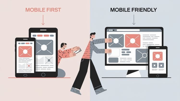
It's easy to confuse Mobile First with Mobile Friendly , but they are not the same thing.
Mobile FriendlyA site designed primarily for desktop and then adapted to work on mobile. While functional, it may lack real optimization for small screens.
Mobile First: Designed specifically for mobile devices from the ground up, ensuring every element is designed to maximize the experience on small screens.
Appearance
Mobile First
Mobile Friendly
Our Approach
Designed first for mobile, then scaled to desktop.
Adapt a desktop layout for mobile.
Priority
Mobile experience is at the heart of design.
Mobile experience is secondary.
Board
Maximum usability and performance on mobile devices.
Make sure it works well, but not necessarily optimized.
Experience
Focused on small screens and mobile users.
Acceptable, but secondary on mobile devices.
Why is Mobile First Important?
Impact on SEO: Google's Mobile First Index
Since 2018, Google has used Mobile-First Indexing , which means it analyzes the mobile version of your website first to determine its ranking in search results. If your mobile version isn't optimized, you're likely to lose positions, regardless of how perfect your desktop version is.
This makes Mobile First a non-negotiable strategy for those who want to rank highly in search results. According to Google, websites that offer an excellent mobile experience are more likely to retain users and reduce bounce rates, two key factors for SEO.
Mobile traffic growth: data and trends
The statistics don't lie: over 60% of global web traffic comes from mobile devices, and this figure continues to grow. In markets like Asia and Africa, mobile devices account for up to 80% of internet access.
If your site isn't optimized for mobile, you're missing out on a large portion of your potential audience. Furthermore, with the rise of 5G, mobile browsing is expected to become even faster and more accessible, reinforcing the need for a mobile-first approach.
How Mobile First Improves User Experience
A Mobile First design offers:
Intuitive navigation: Simple menus, large buttons, and accessible content.
Optimized loading speed: Mobile-first websites tend to be lighter and faster, which improves the experience and reduces bounce rates.
Greater engagement: A good mobile experience encourages longer interactions and conversions.
Advantages of Implementing a Mobile First Strategy
Optimized performance: Designing for mobile involves reducing unnecessary elements, which improves speed and functionality.
Better SEO positioning: Mobile optimization is a determining factor for Google.
Range Increase: With a mobile-ready site, you'll reach a wider audience.
Preparation for the future: You'll be ready to adapt to new technologies and trends.
How to Implement Mobile-First Design
Basic Principles of Mobile First Design
Design with the essentials in mind: Prioritize content and features that are truly necessary.
Optimize images and resources: Use lightweight formats and make sure images fit on small screens.
Usability before aesthetics: An attractive design is important, but not at the expense of functionality.
Useful tools and frameworks: Bootstrap, Elementor, and more
Bootstrap: An ideal framework for creating responsive sites with Mobile First as a foundation.
Element: Builder of Wordpress which allows you to design specific mobile versions of each page.
AMP (Accelerated Mobile Pages): A Google technology to improve loading speed on mobile devices. It's becoming increasingly obsolete.
Imagine an e-commerce site designed with Mobile First:
Homepage: It includes an optimized banner and prominent "buy now" buttons.
Shopping Cart: Accessible with a single click from anywhere on the web.
Payment forms: Simplified to minimize interaction time.
Common Mistakes When Implementing Mobile First
Neglecting desktop design:
Although mobile devices are a priority, the experience on large screens shouldn't be a disaster.
Overload the page:
Including too many elements in the mobile version can slow down loading.
Ignore tests on real devices:
What works in theory should be tested on different models and resolutions.
Mobile First in the Future of Web Development
With the arrival of 5G and technologies like Web 3.0 , the Mobile First approach will remain key to ensuring the relevance and performance of websites. Furthermore, it is expected to form the basis for designing experiences on emerging devices such as wearables and smart displays.
Conclusion
Mobile-first design isn't just a strategy; it's a standard in a digital world dominated by mobile devices. Implementing it correctly means improving your Google ranking, reaching a wider audience, and delivering a superior user experience. If you haven't taken this step yet, now's the time.
Do you have any questions or experiences with Mobile First? Leave us a comment and we'll be happy to help! 😊
Table of Contents
Share me on your social media
Best Hosting in Spain
Best VPS in Spain
Maria de Mora
Digital Marketing is my life. I specialize in web design and development with WordPress and online advertising. I'm passionate about automation and AI, in all its wide variety. I'm constantly improving my skills and love learning new areas and improving my skills in familiar ones. Day after day, I help companies and freelancers take their businesses to the top. Want to be one of them? Get in touch with me. A lifelong student, I'm currently pursuing a Double Degree in Business Administration and Computer Engineering from the UOC.