Some websites are like enlarged business cards: a photo, four sentences about who you are, and a contact form you practically need a magnifying glass to find. Then there are those other websites that, in a matter of seconds, manage to convey someone's personality without them having to explain much.
They're not always the most spectacular. Some use just two colors and simple typography. Others are full of movement, huge photographs, or small details that invite exploration. The interesting thing is that they all stem from one idea: a personal website should help you show who you are, what you do, and why you're worth getting to know.
If you're looking for examples of personal websites to create your own, you probably already have some saved references. Perhaps you like the minimalism of an architecture website, a photographer's galleries, or the way a writer presents their books. The problem arises when you try to mix them all and end up with a website that has a little bit of each style, but no recognizable personality.
To avoid this, we've selected 15 real websites from writers, designers, photographers, professionals, and creatives. We're not just going to show you pretty pages: we'll analyze what works on each one, what design choices are interesting, and what you could adapt for your own project.
Because inspiration is for learning how to make decisions, not for copying your neighbor's website by changing the logo.
The best examples of personal websites
Before we get into our selection, it's worth clarifying that there isn't a single personal website template that works for everyone.
A writer needs to showcase their publications and make it easy for readers to discover their books. A photographer needs to highlight the images. And a consultant needs to explain their services , convey credibility, and make it easy for visitors to contact them.
That's why we've organized these 15 examples of personal websites by professional profile. The pages and links have been verified against their official sites, although their design may change over time.
The 15 examples in this guide
| Writers | Brandon Sanderson, Elizabeth Gilbert, Neil Gaiman |
| designers and creatives | Adham Dannaway, Anton & Irene, Tobias Ahlin, Alice Lee |
| Photos | Jessica Chou, Chris Burkard, Peter McKinnon |
| Personal Branding | Marie Forleo, Ann Handley, Ali Abdaal |
| Compositions | Bruno Simon, Dennis Snellenberg |
Personal websites of writers and authors
Writers' websites have a particularity: the true protagonist should not only be the author, but also their work.
A good author website allows you to learn about their books, find out where to start reading, discover new releases, and connect with other readers. And all this without becoming a cluttered catalog of covers.
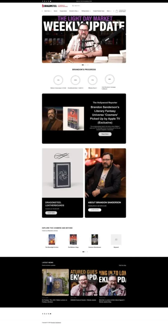
Instead of simply compiling his novels, Brandon Sanderson's website organizes different literary universes and sagas, incorporates news, and offers something particularly interesting: progress indicators for his writing projects. For a community that closely follows each new publication, this information provides a reason to return.
What we can learn: If you have a loyal audience, your website shouldn't just be a static showcase. You can incorporate news, project updates, or exclusive content that encourages readers to visit regularly.
2. Elizabeth Gilbert — When a pitch sets the design
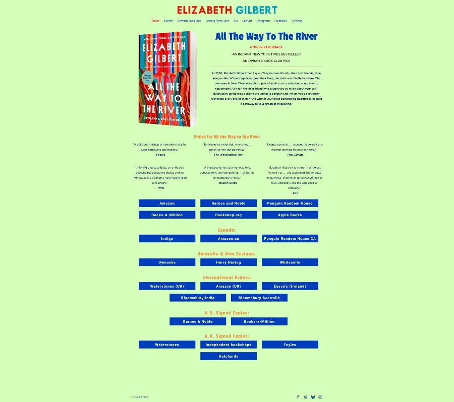
On Elizabeth Gilbert's website, the featured work takes center stage, accompanied by editorial information, reviews, and various purchasing options. The author has an extensive career, but the homepage leverages that prominence to draw attention to a specific publication.
What we can learn: Not all your projects need to receive the same level of attention. If you're launching a book, an exhibition, or a new service, you can temporarily rearrange the cover image to reflect that goal.
3. Neil Gaiman — The Value of a Well-Organized File
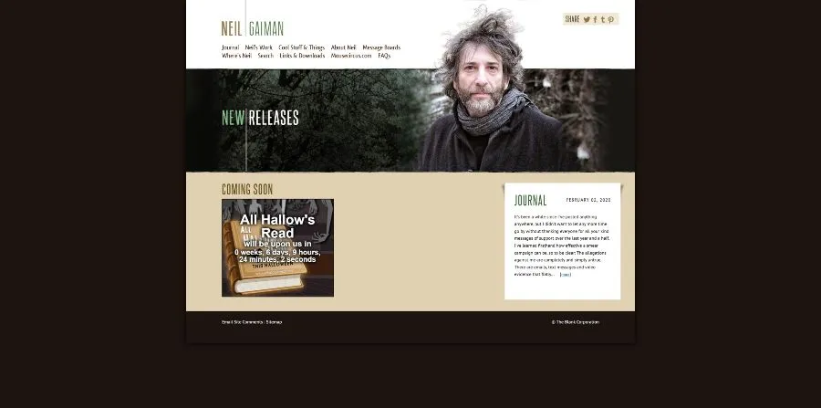
Neil Gaiman's website is a different example. Its main appeal lies not in chasing the latest visual trends, but in compiling an extensive catalog of books, comics, and other works through distinct sections. Its bibliography serves as a reference for discovering works and exploring a very diverse literary career.
What we can learn: If you have many years of experience, content architecture matters as much as aesthetics. A clear organization by works, categories, or professional stages can be more useful than a spectacular cover that makes it difficult to find information.
These three examples demonstrate that web design for writers can serve very different purposes: maintaining a community, promoting a release, or documenting a career.
Portfolios of designers and creative professionals
Here the rules change a bit. When someone hires a designer, illustrator, or creative developer, the website itself becomes part of their business card.
It's not enough to simply claim you have aesthetic sensibility or know how to create digital experiences. Your portfolio should prove it.
However, demonstrating creativity doesn't mean using animations everywhere. A good creative portfolio needs a balance of personality, clarity, and ease of understanding the projects.
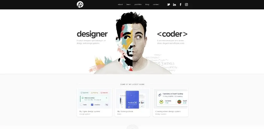
Adham Dannaway combines product design and frontend development. His distinctive visual presentation separates these two facets, allowing for a quick understanding of his professional profile. The website also links to projects, resources, and content related to his work.
What we can learn: When you offer different services, you don't need to hide them under a generic description. You can use visual composition to explain how they complement each other. A good cover quickly answers the question, "What exactly do you do?"
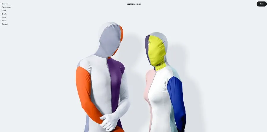
5. Anton & Irene — Projects explain better than adjectives
Although it's a studio run by two professionals, their website is a valuable resource for anyone looking to develop a creative brand. It showcases work for diverse clients and connects these projects to disciplines such as strategy, interface design, art direction, and development. Their portfolio avoids relying solely on a list of skills.
What we can learn: Teaching concrete projects often conveys more than simply describing yourself as "innovative, passionate, and creative." If you include the initial problem, the decisions made, and the outcome of the work, you help others understand your thinking process and what you can contribute.
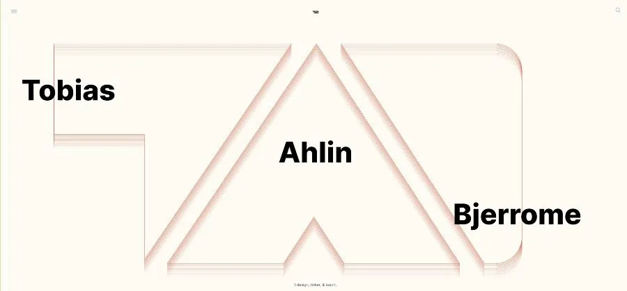
6. Tobias Ahlin — Teaching can also be a way to demonstrate experience
Tobias Ahlin's work revolves around three ideas: designing, experimenting, and teaching. His website features articles, tutorials, and projects like SpinKit and Moving Letters, small tools that allow users to directly appreciate his technical expertise.
What we can learn: your portfolio doesn't have to be limited to client work. Publishing your own resources, experiments, or tutorials also allows you to demonstrate skills, build trust, and attract visitors interested in your area of expertise.
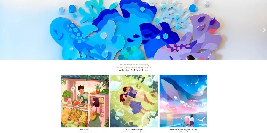
Alice Lee's website showcases illustrations, murals, ceramics, and commercial projects. Images are prominently featured, and her work maintains a recognizable graphic style, even when using different techniques and media. The site also organizes work into categories and facilitates professional inquiries.
What we can learn: a strong visual identity isn't about always using the same template. It's about maintaining recognizable consistency through color, shapes, illustrations, and tone of voice.
These examples of web portfolios show four ways to build creative authority: explaining a specialization, documenting projects, sharing knowledge, and developing your own visual language.
And none of those goals necessarily require using a complicated website.
Websites of photographers and artists
On a photography website, the images have to speak for themselves. But that doesn't mean everything else should disappear.
A good gallery needs rhythm, hierarchy, and organization. Displaying twenty-five photographs in a grid is not the same as constructing a selection where each image has room to breathe.
The following examples show different approaches.
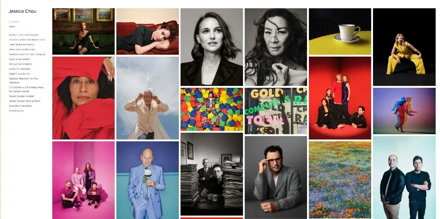
8. Jessica Chou — Letting work take center stage
Jessica Chou's website features a wide selection of editorial portraits and photographic projects. The images are accompanied by titles and references to her publications, allowing visitors to discover both the photographer's style and the professional context of her commissions.
What we can learn: a photographer doesn't need to fill their cover with explanations. A well-organized selection, with information about the projects and a clear way to contact them, can present their work much more effectively than several paragraphs of self-promotion.
9. Chris Burkard — Turning a specialty into a professional identity
Chris Burkard's work revolves around nature, adventure, travel, and surf photography. His website integrates this specialization with his background as a creative director, author, and speaker. Professional identity depends not only on spectacular photography but also on a recognizable thematic territory.
What we can learn: you don't need to showcase absolutely everything you know how to photograph. If you want to establish yourself in a specialty, a coherent selection can communicate your vision better than a gallery where seemingly unrelated works are displayed side by side.
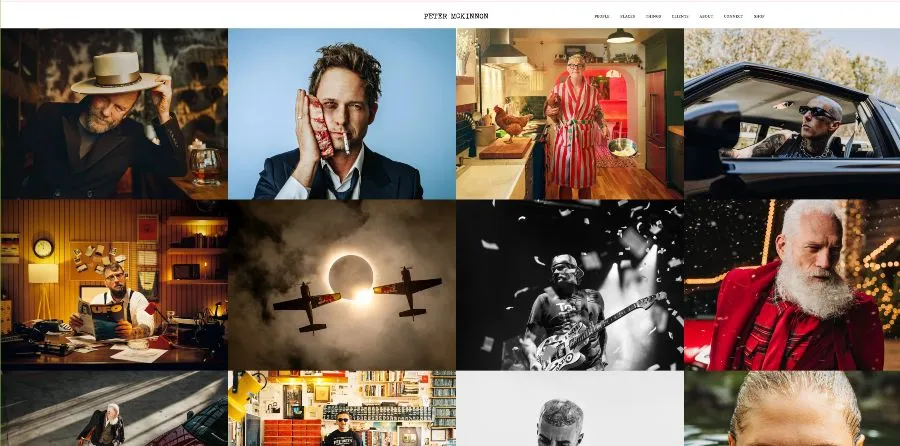
10. Peter McKinnon — A gallery that avoids distractions
Peter McKinnon's website presents a photography portfolio where the images take center stage. Its navigation allows users to explore categories such as portraits and lifestyle photography, reducing the need for decorative elements that might compete with the content.
What we can learn: In certain disciplines, design must know when to step back. A clean structure, good spaces, and well-chosen photographs often work better than a collection of visual effects.
Examples of personal branding websites for professionals
Not all personal websites need to function as art portfolios. For consultants, trainers, specialized writers, and freelancers, the priority is usually different: explaining who they help, demonstrating expertise, and facilitating the next step.
Here, web design for a personal brand needs to combine personality with business clarity. A homepage can be beautiful, but if the visitor doesn't understand what you offer, who you work for, or how to hire you, it's probably not fulfilling its purpose.
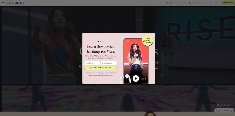
11. Marie Forleo — A personal brand built around her products
Marie Forleo combines her work as an author and communicator with training programs, videos, resources, and business content. Her website brings together different lines of activity under a recognizable identity and offers visitors several ways to begin exploring her work.
What we can learn: When your business grows and you start offering different services or products, you need an architecture that connects them. A personal brand doesn't have to be limited forever to a bio and a contact page.
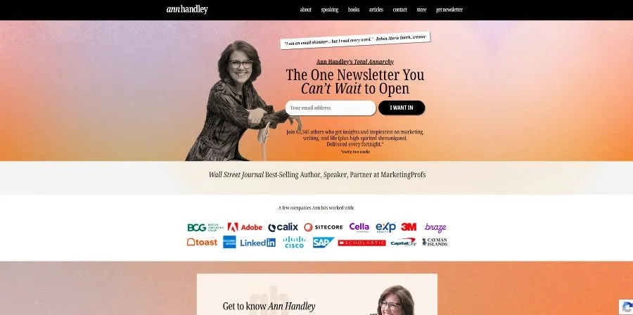
Ann Handley's website gives prominence to her newsletter, Total Annarchy, while showcasing her career as a writer and speaker. It's an interesting decision: instead of treating email as a secondary element, she uses it as a primary way to connect with her audience.
What we can learn: If your strategy relies on sharing knowledge and building a community, your newsletter can play a similar role to your services. It doesn't all have to end with a "Request a quote" button.
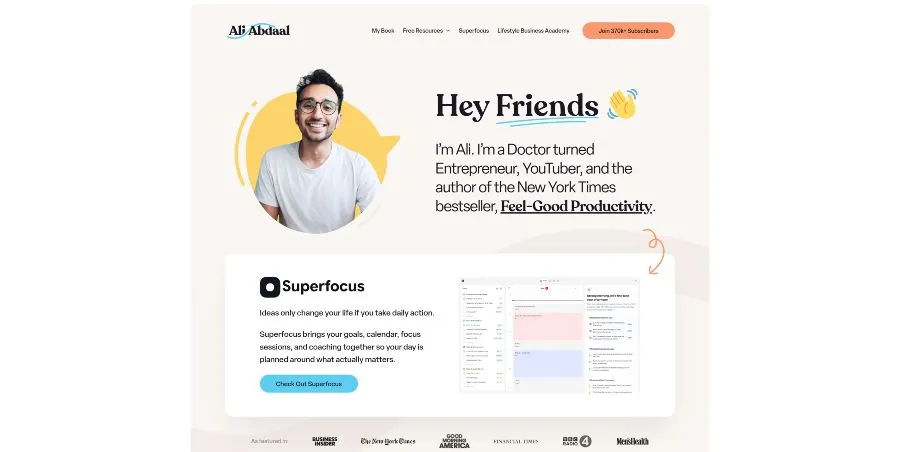
13. Ali Abdaal — Organizing a personal brand with different audiences
Ali Abdaal's website integrates videos, articles, resources, books, and training products. An interesting feature is that it guides visitors based on their goals: learning about productivity, developing a business, or improving specific skills.
What we can learn: When you have audiences with diverse interests, it's not always enough to organize the menu by formats like "blog," "videos," and "courses." You can also structure the navigation around user needs.
These three cases show that a good personal branding website isn't built solely around the physical appearance, biography, or achievements of the person behind it. It also needs to consider the person visiting it.
Are you looking for information? Do you want to hire a service? Do you need to know about your experience? Are you interested in a course?
The sooner you can find your way, the more useful the website will be.
Original personal websites that break with the norm
We conclude the selection with two projects that demonstrate how far digital creativity can go when one's own experience is part of what a professional wants to teach.
These websites are amazing, but it's important to analyze them with perspective. Experimental navigation can be fantastic for a creative developer but completely unnecessary for a consultancy.
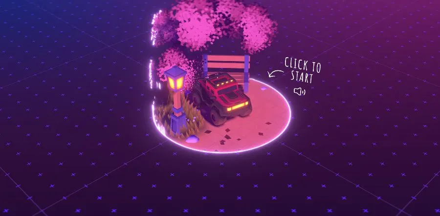
14. Bruno Simon — A portfolio that becomes an interactive experience
Bruno Simon's portfolio allows you to explore a three-dimensional environment by driving a small vehicle. Instead of presenting his programming skills through a list of technologies, he demonstrates them directly with an experience developed using Three.js and other tools.
What we can learn: When your specialty is creating digital experiences, your own website can become a showcase of your skills. However, creativity must be accompanied by considerations of performance, accessibility, and ease of use.
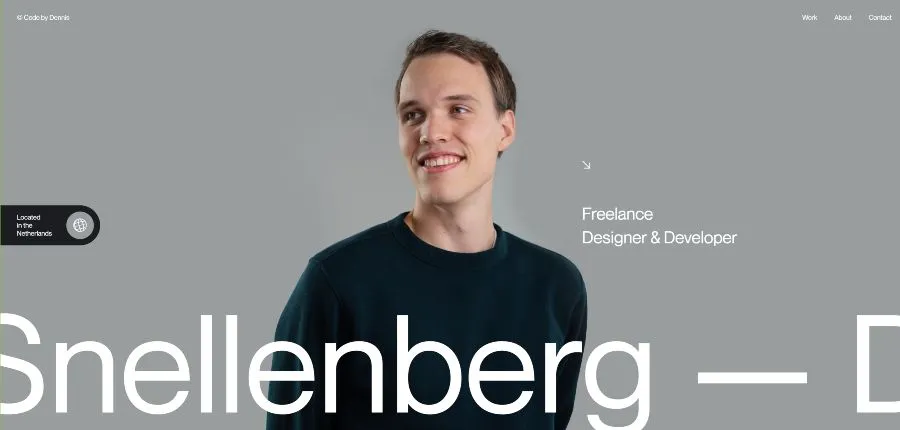
15. Dennis Snellenberg — When animations are part of your identity
Dennis Snellenberg's portfolio proves that you don't need to turn a website into a video game to create a memorable experience. His design combines large-format photography, prominent typography, smooth transitions, and subtle animations that guide the visitor as they explore his projects.
What's interesting is that these resources aren't just for show. Dennis specializes in the design and development of digital experiences, so his website serves as a demonstration of his capabilities. It also allows users to explore real projects and easily access his professional and contact information.
What we can learn: Animations and micro-interactions can add personality to a website when they make sense in relation to the work we want to showcase. The secret is to use them to enhance the user experience without sacrificing readability, accessibility, or ease of navigation.
The last two examples, Bruno Simon and Dennis Snellenberg, show two distinct ways of transforming a personal website into a showcase of talent. The former opts for a striking three-dimensional experience; the latter uses movement, composition, and transitions to convey his mastery of interactive design.
This doesn't mean you should fill your website with animations. It means that design can showcase your skills even before anyone reads your resume.
And that's one of the best lessons we can learn from these portfolios: originality works when it's connected to your professional identity, not when it's used solely to attract attention.
What do the best personal websites have in common?
After seeing fifteen such different examples, it might seem that there are no common rules. Some use photography, others text, some opt for understated designs, and others turn navigation into an interactive experience.
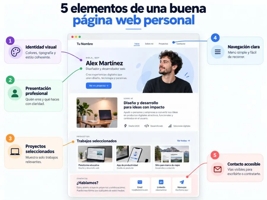
However, the best personal websites usually address three needs: having a recognizable identity, presenting the work in an understandable way, and making it easy for the visitor to find what they are looking for.
A visual identity that reflects who you are
Visual identity is not simply choosing your favorite colors and using them on all the buttons.
It is the combination of fonts, images, composition, colors and tone of communication that helps make your page consistent with your activity.
An architectural photographer might need a minimalist presentation and spacious settings. A children's book illustrator might use a much more expressive visual style. Neither option is inherently better: what matters is that it fits the professional image you want to project.
In personal branding web design, it's important to avoid a common mistake: choosing a template because it looks modern without asking ourselves if it really represents the work we do.
A clear presentation of your work and experience
You don't need to include every project you've done since you started working.
A well-selected portfolio is usually more convincing than an endless collection where current work coexists with work that no longer represents your professional level.
Whenever possible, provide context for what you show. Briefly explain what the client needed, what your contribution was, and what you delivered. If you have verifiable results and permission to share them, you can also include them.
This helps demonstrate experience without relying exclusively on statements like "I am creative," "I offer innovative solutions," or "I am passionate about my work."
Simple navigation and an easy way to contact
A personal website should allow you to quickly answer three questions: who you are, what you do, and how people can contact you.
Not all of them need the same menu, but they do need a clear and understandable organization. In many cases, a homepage, a professional presentation, projects or services, and a contact page will suffice.
It's also important to pay attention to the mobile version, the contrast of the texts, the size of the buttons, and the loading speed.
An animation can look spectacular on a powerful computer and become an obstacle on a phone with a limited connection.
Therefore, visual originality should never be used as an excuse to neglect the user experience.
How to choose the right design for your personal website
After saving several examples, it's time to make decisions. And here it's best to start with a question that's far less exciting than choosing colors: what do you want to achieve with your website?
If you're a writer, you might need to showcase your books and keep your readers informed. If you work as a photographer, your priority is probably to display projects and secure new commissions. And if you're a consultant, your website will need to explain the services you offer and make it easy for potential clients to contact you.
The design must respond to that objective, not the other way around.
Personal page type | A style that might suit | What should I highlight? |
|---|---|---|
Writer or author | Editorial | Books, biographies and new releases |
Graphic Designer | Creative or minimalist | Projects and visual identity |
Photographer | Visual and immersive | Galleries and selected works |
Consultant or professional | Clear and corporate | Experience, services and contact |
Illustrator or artist | Expressive and artistic | Works and unique style |
Creative Developer | Experimental | Interactive skills and projects |
These styles are not rigid categories. A writer might opt for a minimalist website, while a consultant might have a highly creative visual identity.
The important thing is that the aesthetic decisions do not hinder the understanding of the content.
You should also consider how much time you can dedicate to maintenance. A page full of animations, effects, and custom features may require more attention than a well-structured portfolio.
At Zudro Digital Media, we develop websites with WordPress , adapting their structure and design to the needs of each project. A personal website should allow you to grow, update your content, and modify the presentation of your services without having to start from scratch every time your business evolves.
FAQ
It depends on your business, but it's usually a good idea to include a clear presentation, information about your experience, a selection of projects or services, and some easy way to contact you.
You can also add posts, verifiable testimonials, downloadable resources, or a newsletter when they make sense for your goals.
You don't need to fill your menu with sections just to make your website look more complete. It's better to offer a few useful pieces of content than to publish empty or repetitive pages.
They are not incompatible options.
An online portfolio focuses primarily on showcasing work and projects. A personal website can have a broader scope and include services, a biography, articles, products, resources, and other ways to engage with the audience.
For a designer or photographer, the portfolio can be the centerpiece of their personal website. For a consultant, it probably makes more sense to highlight services and use case studies as supporting evidence.
There are different options, including WordPress, Webflow, Framer, Wix, and Squarespace.
The choice depends on the type of project, your knowledge, the level of customization, and how easily you want to update the website.
For a simple page, a visual builder may suffice. If you need a more extensive content structure, specific integrations, or custom functionalities, it's worth exploring a solution that allows the project to evolve without unnecessary limitations.
There is no single best platform for all situations.

Conclusion
The best examples of personal websites are not always those that use the most animations, spectacular photographs, or amazing effects.
These are the ones that manage to convey a recognizable identity and make it easier for the visitor to understand what the person behind it does.
Throughout these fifteen examples we have seen very different ways of achieving this: writers who turn their websites into spaces for readers, photographers who let their images speak, professionals who organize their knowledge, and creatives who use navigation itself to demonstrate their skills.
The lesson is not about choosing which of those pages you want to copy.
It involves discovering what you need to communicate, who you want to reach, and what design decisions can help you achieve that.
Because your personal website doesn't have to look like a famous professional's. It should represent your work, be useful to your visitors, and evolve with you.
At Zudro Digital Media, we understand web design as a combination of identity, content, and user experience. A good website can be visually appealing, but it must also be clear, functional, and serve a specific purpose.
And that's probably the best takeaway we can get from all these examples: you don't need the most extravagant website on the internet. You need a website that makes sense to you and the people you want to attract.