Color Combinations for Web Design: Ideas That Work

Table of Contents

Choosing colors for a website isn't a painting game. It's a strategy.
A successful combination can convey confidence, reinforce your message, improve conversions...
And a bad one… can ruin the user experience before they even read a single word.

Why is this so important?
Because color is the first thing perceived, even before someone understands your value proposition. Emotions are quickly aroused, and color is one of the most powerful ways to activate them.

In this post, you'll not only see 20 visually captivating color combinations, but I'll also explain why they work, how to apply them, and what mistakes to avoid.
Get ready to be inspired, but above all, to make intentional decisions.

What Makes a Color Combination Work?

Color psychology: it's not just aesthetics

Your website might be the fastest, the best structured, and have text that borders on poetry… but if the colors don't resonate with your audience, something's missing. Color psychology is more present in web design than we'd like to admit.

Color
Main association
Blue
Confidence, professionalism, calm
Red
Energy, urgency, drive
Green
Nature, health, sustainability
Yellow
Optimism, attention, youth
Black
Elegance, sophistication, power
Coral pink
Creativity, closeness, femininity
Grey
Neutrality, technology, balance

Example : Would you use black and gold for a daycare? Or bright fuchsia for a law firm? Probably not.

Color communicates. That's why it's not just about what you like , but about what represents you.

Contrast, harmony and visual hierarchy

A well-thought-out palette isn't just pretty. It's logical. It's functional.

  • Contrast : So that the texts are easy to read, the buttons are visible, and the important information is understood effortlessly.

  • Harmony : So that the design flows, without tension or stridency.

  • Hierarchy : Think about your base color, a secondary color to accompany it, and an accent color to stand out.

🎯 Tip: View your website in grayscale. If key elements aren't visible, something is wrong with your palette.

The mistake of choosing “pretty” palettes without purpose

Pinterest is full of spectacular palettes. But beware: many of them only work in mockups, not on real websites.

Before choosing colors ask yourself:

  • What do I want to convey with this website?

  • What kind of emotions should users feel?

  • What environment will it be viewed in? Mobile? Big screen? Good lighting?

Before Choosing Colors: Define Your Brand and Your Goals

Colors according to type of business: a clinic is not the same as a skate shop

Your website can't be the same whether you're a legal consultancy, a natural cosmetics brand, or a video game app. Every business has a tone, an energy, a message.

Business Type
Desired emotion
Typical colors
Clinic / Health
Calm, confidence, cleanliness
Light blue, soft green, white, light gray
Aesthetics / Natural Beauty
Purity, freshness, well-being
Mint green, beige, lavender, off-white
Youth e-commerce
Creativity, dynamism, fun
Bright yellow, coral, violet, turquoise
Urban fashion / Skate / Streetwear
Rebellion, youth, originality
Black, red, lime, cement gray
Organic gastronomy
Naturalness, proximity, sustainability
Olive green, earth brown, cream, mustard
Gourmet restaurant / Haute cuisine
Elegance, sophistication, exclusivity
Burgundy, black, gold, ivory white
Creative Agency
Differentiation, surprise, avant-garde
Neon pink, electric blue, black, purple
Lawyers / Legal / Notaries
Authority, security, professionalism
Navy blue, graphite gray, white, gold
Finance / Insurance
Stability, control, confidence
Dark blue, white, petrol green, steel grey
Technology Sector / Startups
Innovation, agility, modernity
Cobalt blue, black, lime green, metallic gray
Tourism / Travel
Inspiration, freedom, positive energy
Sky blue, orange, water green, sand
NGOs / Social Sector
Commitment, empathy, closeness
Hope green, white, light blue, terracotta
Online Education / Training
Clarity, growth, dynamism
Vibrant blue, white, yellow, light blue
Events / Weddings / Photography
Emotion, beauty, romance
Dusty rose, cream, gold, taupe
Gaming / Apps / Entertainment
Addiction, energy, immersion
Deep purple, black, fluorescent green, electric cyan
luxury products
Exclusivity, elegance, desire
Deep black, gold, ivory white, burgundy
Sustainable / ecological products
Respect, harmony, awareness
Moss green, sand, light brown, off-white

How to identify what emotions you want to convey

Do this mini exercise:

  1. Write 3 adjectives that describe your brand.

  2. Write how you want the user to feel on your website.

  3. Look for palettes that reinforce that feeling.

Example: If your brand is modern, professional, and approachable , don't go for a beige palette with soft browns. Try cobalt + white + dark gray.

Real examples of websites well aligned with your palette

  • Dropbox : Use soft, blue tones with plenty of white space. It conveys ease, order, and professionalism.

  • Mailchimp : bold colors (mustard yellow, black, cream) for a creative and approachable brand.

  • Everlane : neutrals, whites and touches of green and coral for a minimalist, ethical and conscious clothing brand.

The 20 Best Color Combinations for Web Design

Web design isn't (just) about making something "look pretty." It's about guiding the user, conveying emotions, and connecting. A good color combination can make a visitor trust you in seconds... or make them close the tab without looking back.

Here are 20 color combinations for websites that have proven effective: they evoke emotion, they convert traffic, and they convey exactly what a brand wants to communicate without a single word. And that's not all: I'll explain when to use them , what they convey , their HEX codes , and real-world examples.

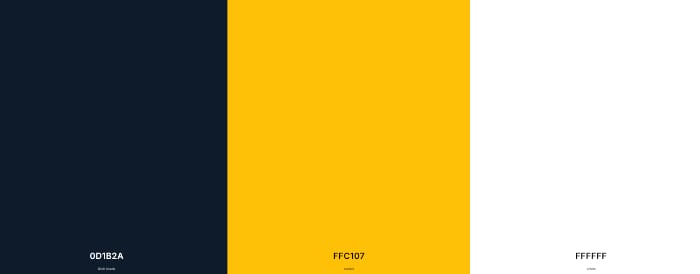
1. Navy Blue + Mustard + White

color combinations for the web

💬 What does it convey?

Confidence, professionalism, elegance with a modern touch.

🧠 Who does it work for?

Perfect for brands that want to project seriousness without appearing cold. Ideal for architectural firms, marketing agencies, and modern consulting firms.

🎨 Colors

  • Navy blue: #0D1B2A

  • Mustard: #FFC107

  • White: #FFFFFF

✅ Example of use:

  • White or navy blue background.

  • Mustard buttons to draw attention without shouting.

  • Fonts in white or medium gray depending on the background.

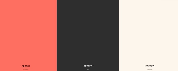
2. Coral + Dark Gray + Ivory

color palettes for the web

💬 What does it convey?

Warmth, closeness and current style.

🧠 Who does it work for?

Personal brands, lifestyle blogs, fashion, small businesses with a human touch.

🎨 Colors

  • Coral: #FF6F61

  • Dark gray: #2E2E2E

  • Ivory: #FDF6EC

✅ Example of use:

  • Very soft ivory background to maintain lightness.

  • Coral in buttons, links and highlighted headlines.

  • Dark grey for main texts and hierarchy.

🎨 This palette conveys care, style, and emotion. Widely used by brands with a distinctive voice and emotional branding .

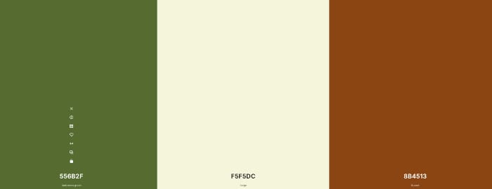
3. Olive Green + Beige + Earth Brown

color palettes for web design

💬 What does it convey?

Nature, balance, authenticity.

🧠 Who does it work for?

Sustainable brands, organic farming projects, natural cosmetics, rural tourism.

🎨 Colors

  • Olive green: #556B2F

  • Beige: #F5F5DC

  • Earth brown: #8B4513

✅ Example of use:

  • Beige or off-white background.

  • Olive green as an accent color (buttons, icons).

  • Earth brown for headings or highlights.

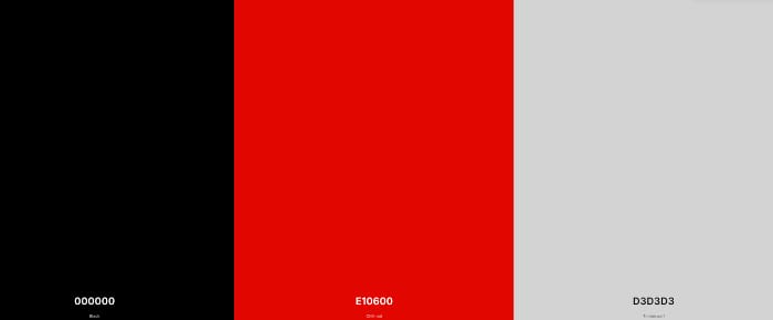
4. Black + Red + Light Gray

color combinations for the web

💬 What does it convey?

Strength, determination, power.

🧠 Who does it work for?

Sports brands, magazines, gaming, cars, energy brands, or rebellion.

🎨 Colors

  • Black: #000000

  • Red: #E10600

  • Light grey: #D3D3D3

✅ Example of use:

  • Black or light gray background.

  • Red on buttons and key elements (such as alerts or prices).

  • White or gray fonts on dark backgrounds.

⚡ This palette isn't for everyone. But if your brand is strong, it's a statement in itself.

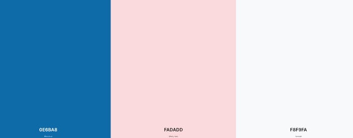
5. Cobalt Blue + Soft Pink + Ice White

color palettes for web design

💬 What does it convey?

Modernity, creativity and a breath of fresh air.

Are you interested in reading:  Divi or Elementor, which is better?

🧠 Who does it work for?

Startups, tech brands with a friendly tone, digital products, educational websites.

🎨 Colors

  • Cobalt blue: #0E6BA8

  • Soft pink: #FADADD

  • Ice white: #F8F9FA

✅ Example of use:

  • Ice white background.

  • Cobalt blue in headers, buttons, and interactive elements.

  • Pink for soft accents and details (shadow, underlines, hover…).

💡 This combination proves that technology doesn't have to be serious or cold. It serves to bring people closer and connect.

6. Lavender + Stone Grey + Snow White

💬 What does it convey?

Delicacy, tranquility, soft modernity.

🧠 Who does it work for?

Yoga studios, wellness brands, self-care projects, and personal development.

🎨 Colors

  • Lavender: #E6E6FA

  • Stone gray: #7D7D7D

  • Snow White: #FAFAFA

✅ Example of use

  • Very light snow white background.

  • Lavender for icons, underlines, sliders or background areas.

  • Stone gray for important titles or paragraphs.

💡 It's an ideal palette for UX geared toward calm and smooth navigation, without any stridency.

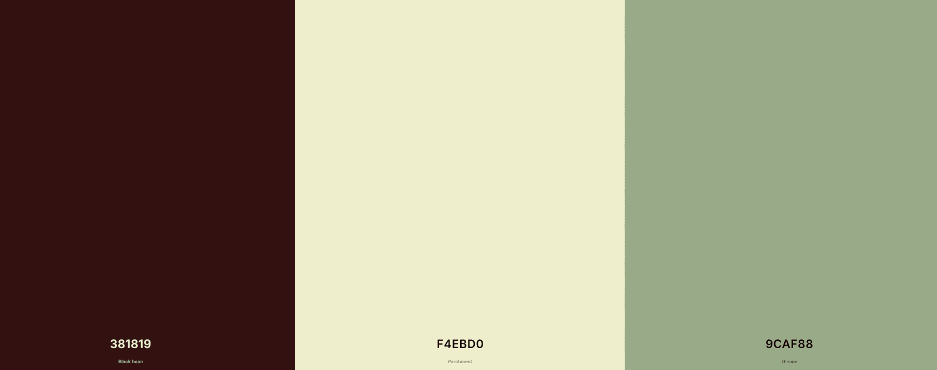
7. Chocolate Brown + Sand + Sage Green

color combinations for the web

💬 What does it convey?

Earth, connection, tradition, rustic style.

🧠 Who does it work for?

Restaurants serving traditional cuisine, artisanal products, and eco-friendly or sustainable projects.

🎨 Colors

  • Chocolate brown: #381819

  • Sand: #F4EBD0

  • Sage green: #9CAF88

✅ Example of use

  • Sand or off-white background.

  • Brown for headlines and elements that need visual weight.

  • Sage green as a soft contrast on buttons or highlights.

🍂 Perfect for brands that want to convey origin, raw materials, essence.

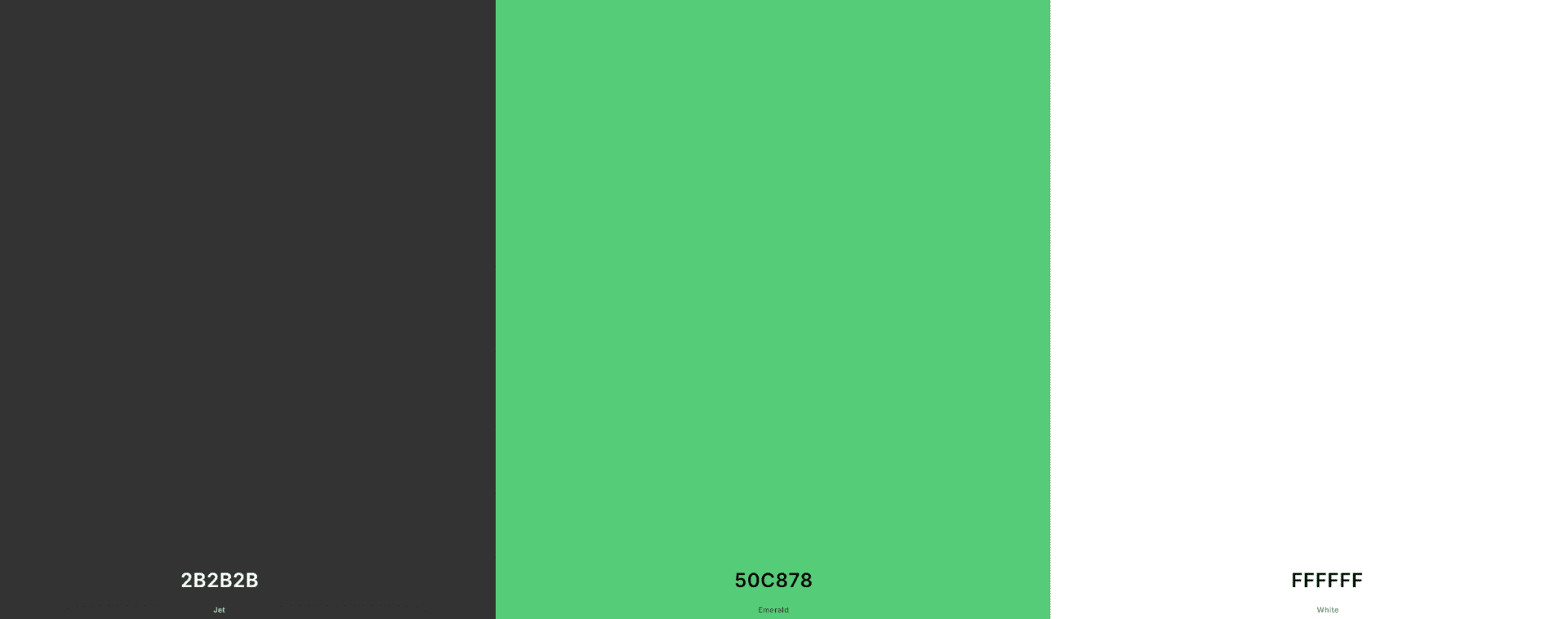
8. Dark gray + Emerald green + Pure white

color combinations for the web

💬 What does it convey?

Sophistication, authority and freshness.

🧠 Who does it work for?

Modern law firms, technology consulting firms, UX/UI design.

🎨 Colors

  • Dark gray: #2B2B2B

  • emerald green: #50C878

  • Pure white: #FFFFFF

✅ Example of use

  • White or very light grey background.

  • Emerald green for buttons, CTAs, and visual highlights.

  • Dark grey for typography.

🖥️ Very suitable for combining sobriety with a spark of innovation.

9. Petrol Blue + Rust Orange + Cream

color combinations for the web

💬 What does it convey?

Character, contrast, sophisticated warmth.

🧠 Who does it work for?

Cultural brands, creative agencies, interior design studios.

🎨 Colors

  • Petrol blue: #004B49

  • Orange oxide: #C1440E

  • Cream: #FFF5E1

✅ Example of use

  • Softening cream base.

  • Blue in fixed elements such as menu and footer.

  • Orange as a vibrant accent to stand out.

🎭 This palette has presence and an intellectual touch. It adds weight and personality.

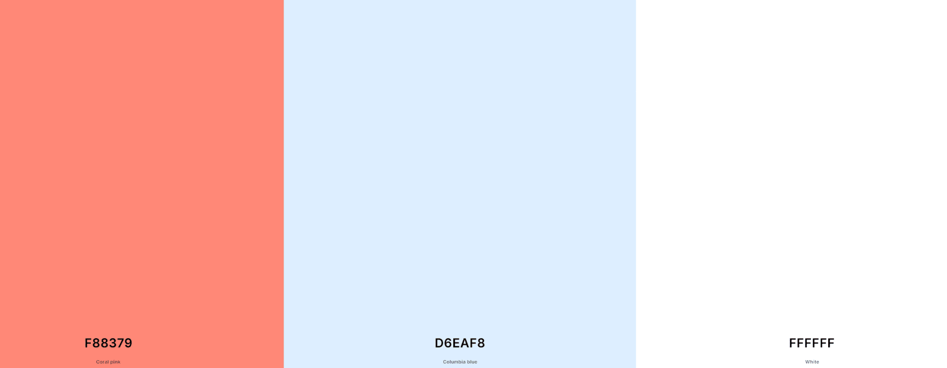
10. Coral Pink + Ice Blue + White

color combinations for the web

💬 What does it convey?

Freshness, modern sweetness, closeness.

🧠 Who does it work for?

E-commerce for handmade products, women's websites, content creators.

🎨 Colors

  • Coral pink: #F88379

  • Ice blue: #D6EAF8

  • White: #FFFFFF

✅ Example of use

  • White or soft ice blue background.

  • Coral pink as a warm accent color.

  • Very effective for visual storytelling and brand humanization.

🧁 Subtle, pleasant, and very usable for visual or emotional content.

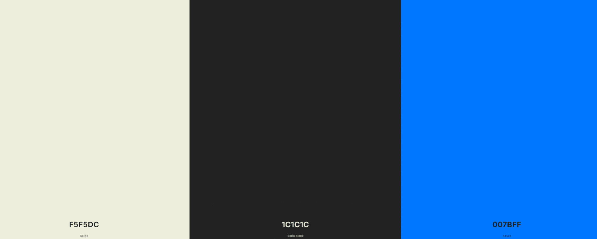
11. Beige + Charcoal Black + Electric Blue

color combinations for the web

💬 What does it convey?

Elegance, contrast, modern sophistication.

🧠 Who does it work for?

Luxury brands, creative portfolios, interior design, fashion.

🎨 Colors

  • Beige: #F5F5DC

  • Carbon black: #1C1C1C

  • Electric blue: #007BFF

✅ Example of use

  • Beige or white background.

  • Black for typographic base.

  • Electric blue as a visual impact on buttons or animated iconography.

⚡ A sophisticated combo that plays with the classic and the disruptive.

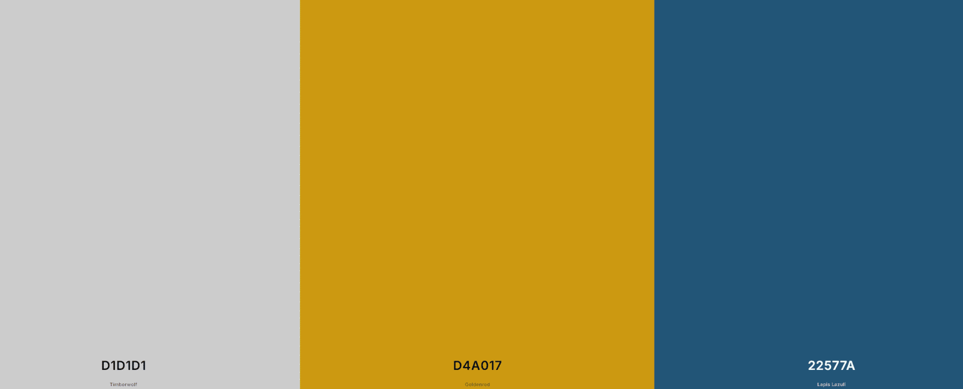
12. Smoke gray + Dark mustard + Sea blue

color combinations for the web

💬 What does it convey?

Flexible seriousness, reliability with creativity.

🧠 Who does it work for?

B2B startups, tech websites, SaaS.

🎨 Colors

  • Smoke gray: #D1D1D1

  • Dark mustard: #D4A017

  • Sea blue: #22577A

✅ Example of use

  • Light grey or white background.

  • Blue for navigation and titles.

  • Mustard for accent, hover or infographics.

🚀 Very well balanced for brands looking to appear solid but fresh.

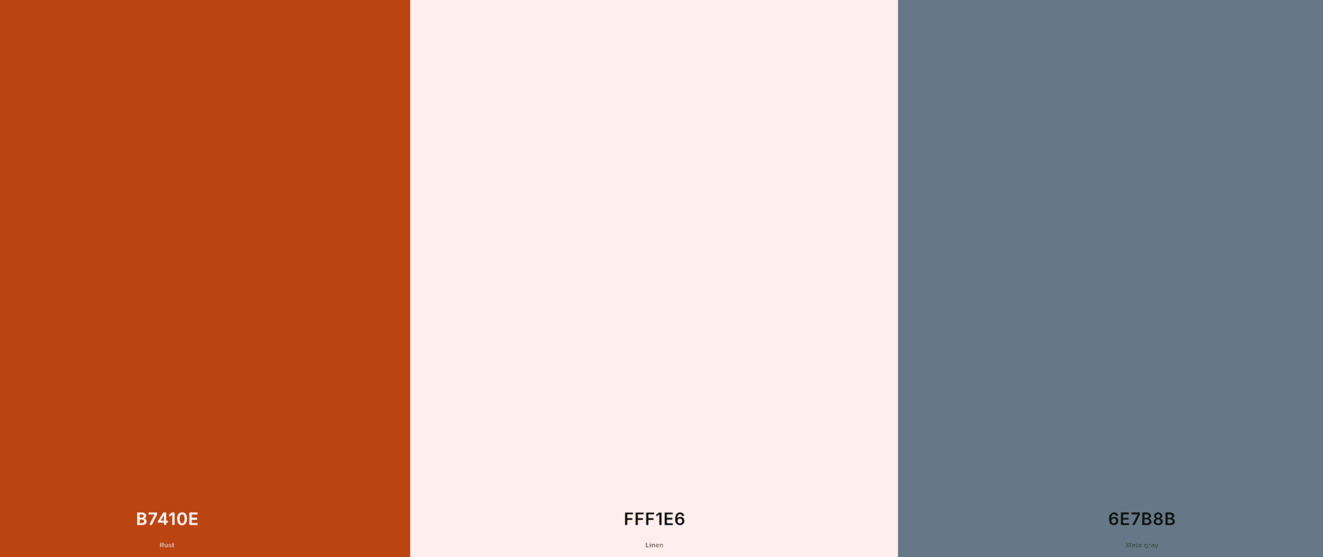
13. Brick red + Cream + Greyish blue

color combinations for the web

💬 What does it convey?

Tradition, warmth, humanity.

🧠 Who does it work for?

NGOs, historical storytelling, cultural or publishing projects.

🎨 Colors

  • Brick red: #B7410E

  • Cream: #FFF1E6

  • Blue-gray: #6E7B8B

✅ Example of use

  • Cream base to avoid stiffness.

  • Titles in blue-gray or brick red.

  • A style that works very well in vertical scrolls with a lot of narrative.

📖 Ideal for telling stories, connecting with values, and showcasing legacy.

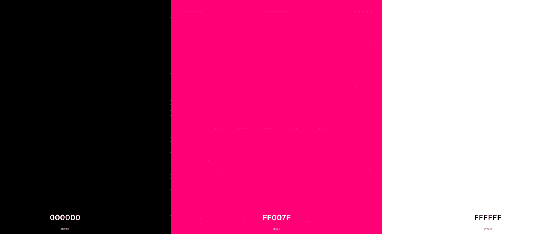
14. Absolute Black + Neon Pink + White

color combinations for the web

💬 What does it convey?

Impact, boldness, groundbreaking style.

🧠 Who does it work for?

Urban fashion, art projects, very young or disruptive brands.

🎨 Colors

  • Black: #000000

  • Neon Pink: #FF007F

  • White: #FFFFFF

✅ Example of use

  • Black background with white fonts.

  • Neon pink for calls to action and animated visual effects.

💥 If your brand screams personality, this palette underlines it with fluorescence.

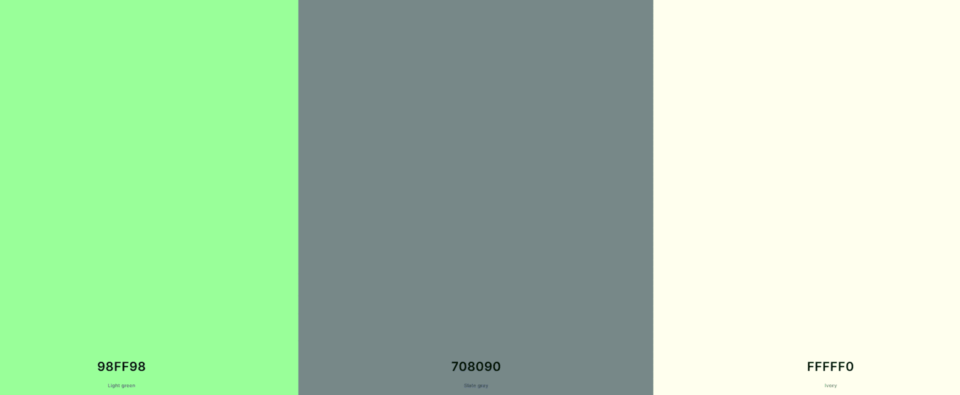
15. Mint Green + Slate Gray + Ivory

color combinations for the web

💬 What does it convey?

Freshness, minimalism, serene modernity.

🧠 Who does it work for?

Alternative health, dietetics, and calm technology companies.

🎨 Colors

  • mint green: #98FF98

  • Slate gray: #708090

  • Ivory: #FFFFF0

✅ Example of use

  • Ivory background.

  • Mint green for supporting elements or graphics.

  • Slate grey in main texts.

🌿 Ideal for relaxed UX and clean sensations.

16. Sky blue + Mustard + Off-white

color combinations for the web

💬 What does it convey?

Optimism, freshness, friendliness.

🧠 Who does it work for?

Apps, training, companies with strong human values.

🎨 Colors

  • Sky Blue: #87CEEB

  • Mustard: #FFB300

  • Off-white: #FDF6E3

✅ Example of use

  • Off-white background for warmth.

  • Blue and mustard in interactive elements.

☀️ Cheerful but not loud. Great for storytelling.

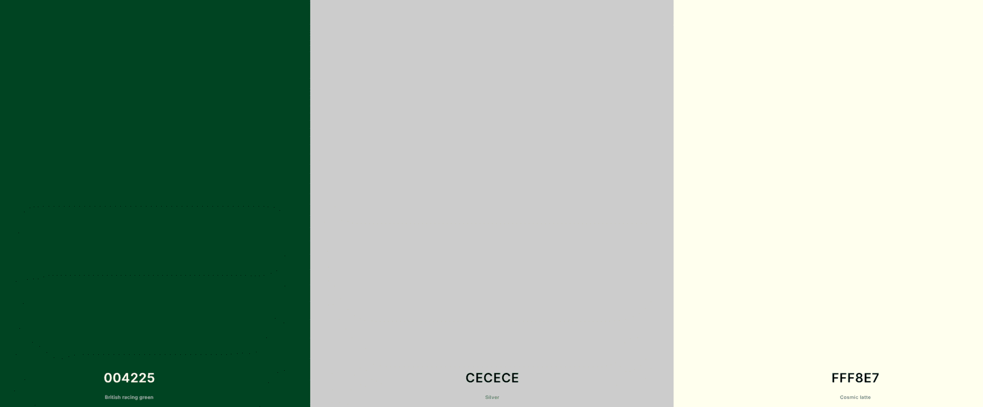
17. Bottle Green + Pearl Gray + Warm Cream

color combinations for the web

💬 What does it convey?

Stability, authenticity, discreet elegance.

🧠 Who does it work for?

Housing, interior design, sustainability, architecture.

🎨 Colors

  • Green bottle: #004225

  • Pearl gray: #CECECE

  • Warm cream: #FFF8E7

18. Dark Blue + Old Gold + White

color combinations for the web

💬 What does it convey?

Luxury, maturity, professionalism.

🧠 Who does it work for?

Premium consulting, classic fashion, finance.

🎨 Colors

  • Dark blue: #002244

  • Old gold: #C28840

  • White: #FFFFFF

19. Deep Purple + Lime + Black

color combinations for the web

💬 What does it convey?

Boldness, innovation, creative technology.

🧠 Who does it work for?

Tech brands, video games, blockchain, startups.

🎨 Colors

  • Purple: #800080

  • Lima: #DFFF00

  • Black: #000000

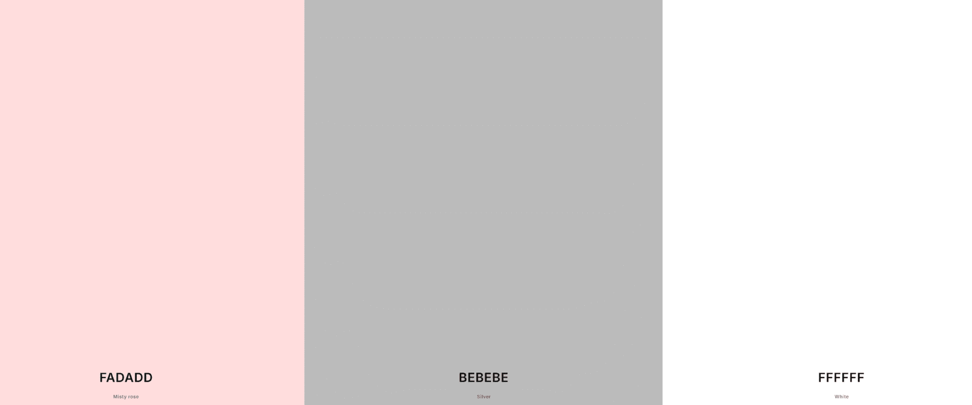
20. Dusty Pink + Warm Gray + White

color combinations for the web

💬 What does it convey?

Modern romanticism, softness, closeness.

🧠 Who does it work for?

Weddings, decor, women's blogs, brands with an emotional tone.

🎨 Colors

  • powdery pink: #FADADD

  • Warm gray: #BEBEBE

  • White: #FFFFFF

How to Adapt Your Palette to Different Devices

A website doesn't just live on a big screen with the brightness turned all the way up. No. It lives on a mobile phone with the brightness turned down low in bed, on a tablet on a sunny terrace, on laptops with filters turned on… Every user sees your website differently.

And that has a direct consequence:
Colors do not look the same on all devices..
And if your palette doesn't adapt, you could run into usability, readability, and user experience issues that sabotage your design, no matter how beautiful your website looks on your 27-inch monitor.

Colors on screens: what you see on your monitor doesn't always look the same on your mobile.

Let's look at a real example. You're using a light grey (#EEEEEE) as a background. It looks perfect on your laptop. But on many phones with automatic brightness and direct sunlight… that background becomes invisible. And if your texts are medium grey (#666666), be prepared for no one to read anything.

Factors that affect how colors are perceived:

  • Screen type (LED, AMOLED, Retina…)

  • User brightness and contrast settings

  • Dark or light mode of the operating system

  • Active color filters for accessibility

  • Calibration quality of each device

💡 Pro tip : Design in neutral environments (well-calibrated screens, no filters enabled) but always test on real and varied devices. And don't rely solely on simulators.

Accessible contrasts and readability in responsive

It's not just about aesthetics. It's about making your website visible, understandable, and easy for everyone to navigate. And that includes people with visual impairments, seniors, or users simply hanging out on their phones at the beach.

Are you interested in reading:  Resources for creating a professional website

Accessibility isn't optional. It's mandatory (and ethical).

✅ Good practices:

  • Make sure the contrast between text and background is high . Use the WebAIM Contrast Checker tool to check this.

  • Avoid combining very similar colors (such as light gray on white or dark blue on black).

  • Don't use color as the only differentiating element (add underlines to links, for example).

  • If your palette includes pastel colors or soft tones, always combine them with strong blacks or grays for the text.

What about dark mode?

Many devices activate dark mode by default . What happens if your website has a light background and your text is gray or pastel?

Boom. Unreadable.

Solutions:

  • Design a dark-adapted version or make sure your CSS doesn't break down in the browser's dark mode.

  • Use CSS variables to dynamically adapt colors if you have a technical team that can implement it.

  • Test with extensions like Dark Reader to see how your website reacts.

What if your website is very visual?

If you have a lot of photos, illustrations, videos, etc., make sure the color palette doesn't compete with them . What works on a large screen can be overwhelming on a mobile device if there isn't enough visual breathing room.

Practical advice:

  • Use palettes with dominant neutral colors and let the accents shine on small screens.

  • Make sure your backgrounds don’t interfere with the readability of text (yes, even if they’re “pretty”).

📲 FINAL TIP : Open your website on at least three different mobile devices before launching a campaign. Look at your buttons, your text, your links. Are they visible? Are they readable? Do they feel good? If not… go back to color.

Tools for Creating and Testing Color Palettes

Choosing a good color scheme for your website doesn't have to be a mystical or purely intuitive process. In fact, today you have incredible (and free) tools that help you create, test, and even visualize your color palette in real-world environments , without needing to open Photoshop or know any code.

And as always at Zudro Digital Media , I'm not going to give you a soulless list. Here are the tools I truly recommend, with their strengths, how to use them, and who they're ideal for.

1. Coolors

Coolors is a favorite in the industry. Super intuitive and addictive.

✅ The best:

  • You can generate random palettes (and stop the colors you like!).

  • View contrasts, modify tones, and export in various formats.

  • Simulate what it looks like in colorblindness or different visual modes.

👌 Ideal for:

  • Inspire you when you're stuck.

  • Find quick harmonies for a landing page or personal website.

2. Adobe Color

Adobe Color is a pro tool with an artist's soul.

✅ The best:

  • It allows you to work with color harmonies based on the color wheel (analogous, triadic, monochromatic…).

  • It has a gallery with palettes from other users (perfect for inspiration).

  • You can upload an image and extract colors directly from it.

👌 Ideal for:

  • Designers seeking control.

  • More artistic websites or projects that start from a solid visual identity.

3. Khroma

AI goes all in on color with Khroma.

✅ The best:

  • You train the tool with your favorite colors.

  • From there, it generates custom palettes according to your visual style.

  • You can view combinations of fonts, images, layouts, etc.

👌 Ideal for:

  • Personal projects with a distinct style.

  • Designers with particular tastes who avoid the typical.

4. Color Hunt

Color Hunt is fast, minimal, and very useful for immediate inspiration.

✅ The best:

  • Designer-curated palettes.

  • You can search by trends (warmth, contrast, retro, pastel…).

  • Fast and hassle-free export.

👌 Ideal for:

  • Finding visual ideas without much thought.

  • Brands with defined tones that seek freshness or modernity.

5. ColorSpace

ColorSpace is a little-known gem. You enter a color… and it gives you dozens of combinations.

✅ The best:

  • It shows you automatic combinations with your base colors.

  • Provides gradient backgrounds, inspirations, and visual examples.

  • Very useful for finding complementary colors or complete schemes.

👌 Ideal for:

  • Beginner designers.

  • Those who already have 1 corporate color and are looking to build around it.

Browser extensions that help you test live

It's one thing to see your palette on a sample website. It's quite another to test it on real websites. And that's where magic extensions come in:

1. ColorZilla (for Chrome and Firefox)

  • Color picker from anywhere on a website.

  • Copy HEX values instantly.

  • Ideal for spying on other people's palettes in style!

2. Eye Dropper (Chrome)

  • Very similar to ColorZilla, but even lighter.

  • Perfect if you work on web interfaces all day.

3. Site Palette

  • It generates a complete palette for you from any website you visit.

  • Includes previews and export to Sketch, Adobe or Google Art Palette.

🎯 Pro tip: Use these extensions to analyze the competition or get inspiration from websites you admire. But don't copy without understanding the reason behind each color . Context is key.

Tools to check contrast and accessibility

Because not everything is pretty. It also has to be functional and accessible.

These tell you if the contrast between your colors meets accessibility levels (AA or AAA) and give you options to correct them if not.

Common Mistakes When Choosing Colors for Web Design

Let's be clear: choosing beautiful colors isn't difficult ; the challenge lies in making them work well together , make sense, and make the user feel comfortable, guided, and motivated to click.

Here are the most common mistakes we see time and again in web audits (and yes, even big brands make some of them).

Using too many tones without hierarchy

A palette with seven intense colors might seem "fun" at first... but it's like walking into a room with neon lights of every color. It's confusing, overwhelming, and exhausting.

🧠 Solution:

  • Limit your palette to 3 or 4 base colors:

    • 1 main

    • 1 secondary

    • 1 accent

    • 1 neutral (white, gray, black)

  • Use the 60-30-10 technique:

    • 60% base color

    • 30% secondary

    • 10% accent

  • Reserve accents for important elements: buttons, links, calls to action.

Ignoring contrast or accessibility

We touched on this before, but it bears repeating because it is one of the biggest visual sins.

Placing light gray text on a white background, or blue links on a green background, might look nice to you… but it's illegible to a huge portion of your users . Furthermore, failing to comply with accessibility guidelines (WCAG) can lead to lost visits, conversions… or even legal problems if you operate in certain sectors (education, government, healthcare, etc.).

🧠 Solution:

  • Use tools like WebAIM Contrast Checker.

  • Make sure the contrast ratio between background color and text color is at least 4.5:1 (AA level).

  • Use high contrast colors for buttons, menus, and links.

Are you interested in reading:  5 elements that every effective homepage should have (and many don't)

Not taking into account the cultural context of color

This is a more subtle, but dangerous, mistake. Did you know that white is associated with purity in the West… but with mourning in many Asian countries? Or that red represents power in some cultures and danger in others?

If you sell to users in different regions or if you have a global brand, you can't afford to ignore this detail.

🧠 Solution:

  • Research color symbolism in your target markets.

  • If you work with multicultural audiences, opt for neutral and universal color palettes.

  • When you're not sure... ask. Or run A/B tests with different versions of your website based on geolocation.

Choosing colors because they are “in fashion”

Yes, Pantone's "color of the year" is gorgeous. But not everything has to be Very Peri or Peach Fuzz, okay? Fashions change, but your website probably isn't going to be redesigned every three months.

🧠 Solution:

  • Choose a color palette that represents your brand and your long-term values , not something that's just trendy.

  • You can use trending colors in temporary campaigns, landing pages, or banners... but not as the basis of your visual identity.

Copying the palette from another website without knowing why it works

Being inspired is one thing. Copying without analysis is quite another.

What works for a meditation app may fail on a law firm's website. Every brand has its own tone, its ideal client, its own energy.

🧠 Solution:

  • Analyze what the color palette you admire conveys.

  • Ask yourself if that message fits with your brand.

  • And if you're still unsure… conduct a visual brand audit . (Or contact Zudro Digital Media, of course. 😉)

Not testing colors in real-life situations

In what context will your user see those colors? On a phone exposed to sunlight? In dark mode? On a screen with very low brightness?

🧠 Solution:

  • Always test on multiple devices and under real-world conditions.

  • Don't rely solely on the design on your office screen.

  • Use tools like SitePalette or Dark Reader to check your website in extreme situations.

FAQ

Fast answer: across 3 and 5 maximum.
But be careful, it's not just about quantity, but about function.

📌 The ideal:

  • 1 primary color: the dominant one, which defines your identity (think of Facebook's blue).

  • 1 secondary color: that complements and helps to highlight other elements.

  • 1 accent color: the one used on buttons, links, details. Here you can be bolder.

  • 1 or 2 neutral colors: white, black, grays or creams for backgrounds, typography and visual balance.

⚖️ The secret rule? The famous 60-30-10 we mentioned earlier. If you overdo it with colors, your website will look like a meaningless Christmas tree.

Of course. In fact, it's what we all do. What you can't (and shouldn't) do is copy a palette without understanding why it works for that brand.

What to do instead of copying?

  1. Analyze 3 websites that you like visually.

  2. Question: What emotions do they convey in me? What role does each color play?

  3. Adapt the structure to your identity. Not the other way around.

🛠️ Tools like ColorZilla or Site Palette allow you to extract colors from any website. Use them for research, not for cloning.


Designing on a dark background has its tricks. Simply inverting the colors of a light website won't work. A dark background requires contrast, subtlety, and balance.

🎨 Palettes that work well in dark mode:

  • Black + Cobalt Blue + Pearl Gray

  • Charcoal Grey + Lime Green + Ice White

  • Deep Purple + Burnt Orange + Light Gray

⚠️ Beware of:

  • Light grey text that appears invisible.

  • Neon colors that can be “hurtful” to the eyes.

  • Illustrations or photos with a light background that “break” the balance.

💡 Pro tip: If you use a dark background, increase the font thickness and pay close attention to spacing. Your users (and your metrics) will thank you.

Welcome to the club. Sometimes we start with an identity without a strategy… and then over time, something just doesn't add up.

Options:

  1. Partial revision: Keep the main color and update secondary colors and accents to achieve more contrast or consistency.

  2. Complete visual rebranding: If your main color isn't communicating what you want, it's time to rethink it. But do it right, with a solid foundation and clear objectives.

  3. Professional consultation: an expert eye (👋 hi, Zudro) can help you make decisions without losing what you have already built.

🧩 Many brands don't need to change... they just need to fine-tune . Sometimes a simple adjustment of the tone (from "petroleum blue" to "navy blue") can make all the difference.

Yes! And you should, especially if you have traffic or active campaigns.

How to test:

  • A/B testing of buttons with different colors : for example, does the orange button or the blue button work better?

  • Quick polls like "which version do you like best?" on social networks or with tools like Hotjar.

  • Heatmaps to see where your users click (and whether the colors attract attention or not).

Conclusion

If you've made it this far, it's because you know that color on a website isn't just a detail , but one of the pillars of the user experience. A good color scheme for web design not only beautifies , but also communicates, guides, evokes emotion… and converts.

👉 You have learned that:

  • It's not just about "choosing what's pretty," but what's consistent with your brand.

  • Color influences how users feel about your website, even if they don't notice it.

  • Adapting your palette to each device, context, and culture is key.

  • And that tools, mistakes, and best practices can make a difference in your design.

Because yes, there are thousands of palettes on Pinterest. But you don't want "a pretty website."
You want a website that speaks for you, that connects with your audience, that converts.

💬 Any final advice? If you're unsure whether your colors are working or not, if you notice something "off" but you're not sure what... ask us for a visual web audit at Zudro Digital Media. For very little, we'll give you a complete snapshot of what your user sees (and feels) when they visit your website. And how you can improve it without losing your essence.

Table of Contents

Share me on your social media
Best Hosting in Spain
LucusHost, the best hosting
Best VPS in Spain
Raiola Networks
Share me on your social media

Related Entries

web design errors

Web design errors that detract from professionalism

designing an effective homepage

5 elements that every effective homepage should have (and many don't)

Wix or WordPress

Wix or WordPress: Which Platform Is Best for You?

color combinations for web page design

Color Combinations for Web Design: Ideas That Work

web design concept

Web Design Basics

Elementor vs Divi Screenshot

Divi or Elementor, which is better?

Elementor capture

What is Elementor and How Can It Transform Your Website?

web design phrases

The Best Quotes on Web Design for Digital Creatives

Connected digital workspace

Resources for creating a professional website

influence of video games

How video games influence modern web design

Creative studio with digital portfolios

Web design for personal branding: 15 examples and ideas

pink mobile

Mobile First: What It Is and Why It's Crucial for Web Design

Accessibility options

Quick Presets
font Size
Line Height
Letter spacing
color Schemes
text alignment
Options
Reading & Focus
Read Aloud Method
Speed: 1x
Cursor Size